
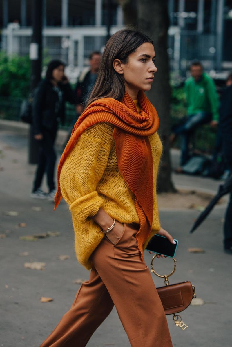
Ever noticed how some colors make you look radiant and others make you look… tired? That’s not imagination — it’s color theory meeting your skin’s undertones. What colors look best on warm skin tones? Rich, earthy, golden hues that echo the warmth already in your skin. Here’s how to find your palette and use it.
First: Confirm You Have Warm Undertones
Quick checks (no single test is definitive — look for consensus):
- Vein test: greenish veins suggest warm; bluish/purple suggest cool; hard to tell suggests neutral.
- Jewelry test: gold looks harmonious and glowing = warm; silver flatters more = cool.
- White test: creamy off-white looks better than stark optic white = warm.
- Sun test: you tan easily and rarely burn = likely warm.
Warm undertones come in all depths — from fair golden to deep rich brown. The principles below apply across the spectrum; only the specific shades shift.
Your Best Colors
- Earth tones: camel, tan, chocolate brown, terracotta, olive, moss green — the warm-undertone home turf. Effortlessly harmonious.
- Warm jewel tones: amber, topaz, warm emerald, deep teal with green lean, ruby with orange lean. Rich and glowing against warm skin.
- Golden yellows and oranges: mustard, marigold, burnt orange, peach, coral, apricot. These are your colors in a way they aren’t for cool tones — wear them proudly.
- Warm reds: brick, tomato, poppy, warm crimson. Avoid blue-reds (they fight warm undertones).
- Cream and ivory: softer and more flattering than stark white near your face.
- Warm neutrals: taupe with yellow lean, warm gray, greige, navy (the universal neutral that works for everyone).
Colors to Wear With Caution
- Cool pastels: icy blue, lavender, cool baby pink — can wash out warm skin. If you love them, wear them away from your face (bottoms, shoes).
- Neon brights: electric blue, hot magenta — they compete with warm undertones rather than complementing.
- Stark white and black: not forbidden, but high-contrast — soften with warm accessories, or choose off-white and espresso instead.
- Blue-based reds and jewel tones: sapphire, blue-red, fuchsia — the cool versions of your warm jewel tones.
The “near the face” rule saves everything: your most flattering colors matter most in tops, scarves, and jewelry. Love a “wrong” color? Wear it on bottom, in shoes, or in a handbag — distance from the face neutralizes most clashes. The same principle applies to makeup and jewelry choices — gold tones harmonize beautifully with warm skin.
Building a Warm-Tone Wardrobe
Translate the palette into a practical wardrobe: base neutrals in camel, chocolate, cream, and navy; accent colors in terracotta, olive, mustard, and warm emerald. This palette mixes effortlessly — it’s essentially an autumn wardrobe year-round, which is why warm-toned dressers often find summer-to-fall transition dressing so natural. For fabric choices in warm weather, our best fabrics for summer clothes guide keeps the palette breathable.
What Colors Look Best on Warm Skin Tones? Your Questions Answered
Can warm skin tones wear black?
Yes — black isn’t forbidden, it’s just high-contrast against warm undertones. The fix is placement and softening: wear black away from the face (pants, skirts, shoes) with warm-toned tops, or soften black near the face with warm accessories (gold jewelry, a camel scarf, warm makeup tones). Off-black alternatives — espresso, charcoal with warm undertones, deep olive — give you the dark-neutral effect with less contrast. Many warm-toned people wear black beautifully; they just style it intentionally rather than head-to-toe stark.
What hair colors suit warm skin tones?
Warm, golden, and rich tones: golden blonde, honey, caramel, copper, auburn, warm chocolate brown, rich espresso. The principle mirrors clothing — golden and warm shades harmonize; ashy, platinum, and blue-black can clash. If you’re warm-toned and love the idea of cooler hair, a compromise exists: “bronde” (brown-blonde blend) with warm undertones, or warm highlights woven through a darker base. Your colorist should assess undertones before formulating — a good colorist does this automatically; a great one explains it.
How do I wear prints if I have warm undertones?
Look at the print’s background and dominant colors, not just the pattern. A floral with a cream background and terracotta blooms is warm-toned; the same floral on stark white with blue-red blooms is cool. Animal prints (leopard, tortoise) are naturally warm and almost universally flattering on warm skin. When a print mixes warm and cool, the dominant 60%+ determines its effect. And the face-proximity rule still applies: a “wrong”-undertone print in a scarf matters more than the same print in shoes.
What’s the difference between warm and olive undertones?
Olive undertones are the confusing middle — they have both warm (yellow-green) and cool qualities, and they don’t fit neatly into warm/cool categories. Olive skin often looks slightly ashen or greenish, tans easily, and finds that both pure-warm and pure-cool colors look slightly off. Muted, earthy tones (olive itself, muted teal, warm grays, soft terracotta) tend to work best. If the standard warm palette feels close-but-not-quite, olive might be your answer — it’s more common than the beauty industry’s binary suggests, especially in Mediterranean, Latin American, and South Asian skin.
Do warm-toned people suit silver jewelry?
Gold is the natural harmony, but silver isn’t banned — it’s about the shade and styling. Bright chrome silver can clash; softer pewter, brushed silver, and mixed metals work better. Many warm-toned people wear silver beautifully by choosing warmer silver tones or mixing metals intentionally (gold and silver together is a legitimate style choice, not a mistake). The old “only gold for warm skin” rule is overstated — cohesion and confidence matter more than strict metal matching. Vogue’s jewelry coverage increasingly showcases mixed-metal styling done well.
The Bottom Line
Warm skin tones glow in earthy hues (camel, terracotta, olive), warm jewel tones, golden yellows, and warm reds — while cool pastels and icy tones need careful placement. Confirm your undertone with the vein and jewelry tests, build your wardrobe around your best neutrals, and remember the face-proximity rule: flattering colors up top, anything goes below. Color is one of the cheapest style upgrades there is — it costs nothing to choose the right shade.