
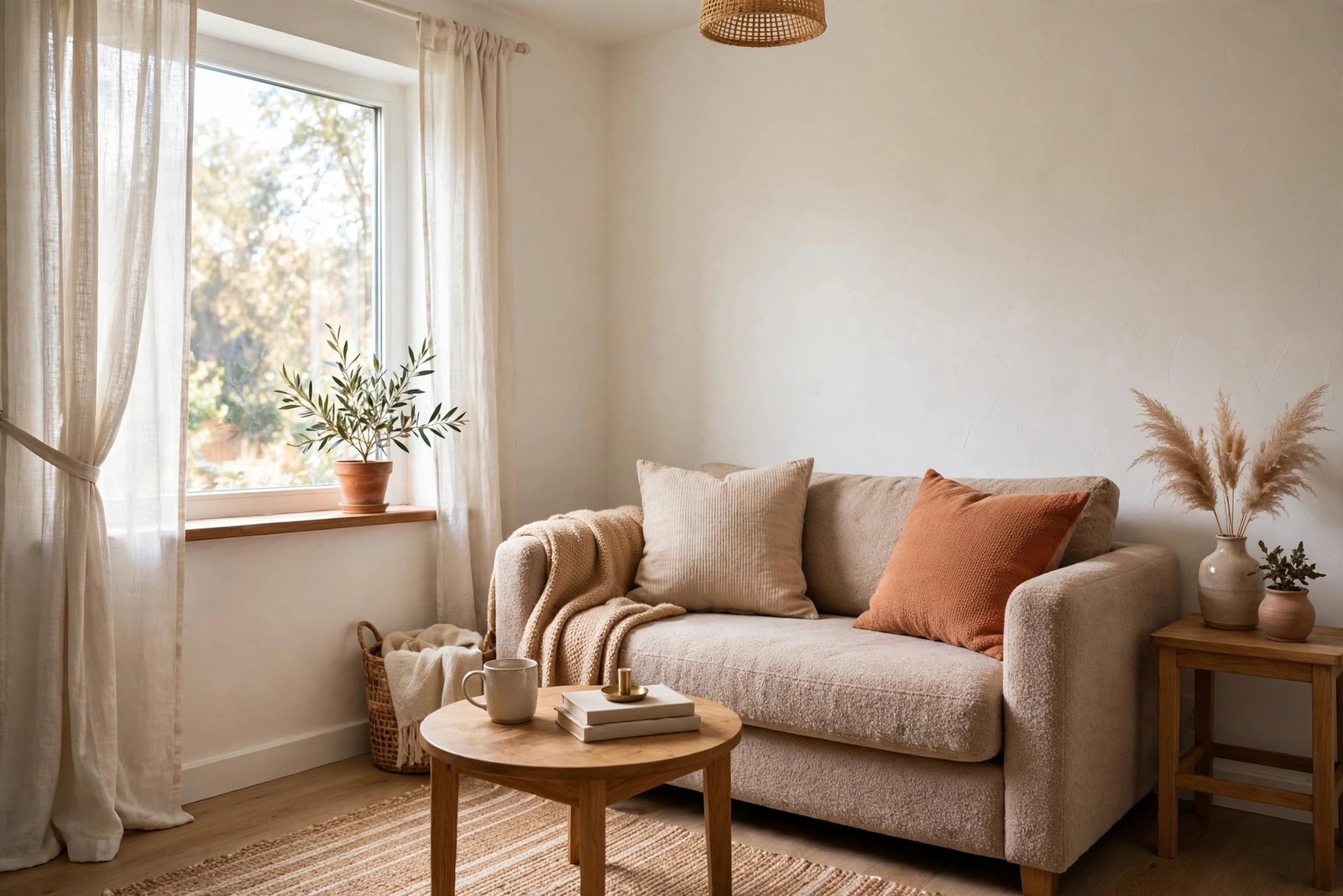
Small living rooms are a design puzzle: you want cozy, not cramped. And nothing changes the feel of a room faster than paint color. So what is the best paint color for a small living room? The conventional wisdom says “paint it white,” but that’s only half the story. The real answer depends on your light, your style, and a few optical tricks designers have used forever. Here’s what actually works.
What Is the Best Paint Color for a Small Living Room? The Short Answer
Light, warm neutrals are the safest bet: soft whites, warm grays (greige), pale beiges, and light sage greens. They reflect the most light, which is what makes a room feel larger — it’s physics, not opinion. But “light neutral” is a big tent, and the specific shade matters enormously. The undertones (pink, yellow, blue, green hiding inside the “neutral”) determine whether your room feels warm and inviting or cold and clinical.
Designer-Favorite Colors for Small Living Rooms
- Warm white (not stark white). Think Benjamin Moore’s White Dove or Sherwin-Williams’ Alabaster — whites with a whisper of warmth. Stark, blue-white can feel sterile in a small space; warm whites feel like sunlight. Browse options at Sherwin-Williams or Benjamin Moore — both have excellent small-room collections.
- Greige. The gray-beige hybrid that dominated the 2010s for good reason: it goes with everything, hides minor wall imperfections, and feels sophisticated without effort.
- Pale sage green. The current designer darling. Green reads as a neutral to the eye (we’re wired to find it calming), and soft sage adds personality while keeping things airy.
- Light warm gray. If you prefer a cooler palette, keep it light and warm-leaning. Dark charcoal in a small room is a bold move that usually backfires.
- Soft blue-gray. Serene, classic, and particularly good in rooms with lots of natural light.
The Case for Going Dark (Yes, Really)
Here’s the contrarian take designers will tell you over wine: dark colors can make a small room feel bigger. It sounds wrong, but dark walls blur the room’s boundaries — corners disappear, and the space feels infinite rather than boxed-in. A deep navy, forest green, or charcoal living room with good lighting feels like a jewel box, not a cave.
The catch: it only works with commitment. Dark walls need adequate lighting (overhead + lamps, warm bulbs), lighter furniture and textiles for contrast, and confidence. Half-measures — one dark accent wall with nothing else changed — usually just look like you ran out of paint. If you’re intrigued, test it: paint one wall dark, live with it for a week, and see how the room feels at different times of day.
What Matters More Than the Color
- Finish. Eggshell or satin reflects a bit more light than flat, which helps small rooms. Save flat for ceilings.
- Ceiling color. Painting the ceiling the same color as the walls (or one shade lighter) erases the visual “lid” line and makes ceilings feel higher. The old white-ceiling default actually emphasizes where the room stops.
- Trim contrast. Crisp white trim against colored walls defines the space nicely. But in very small rooms, painting trim the same color as walls creates a seamless, larger-feeling envelope.
- Natural light. North-facing rooms get cool, bluish light — warm paint colors balance it. South-facing rooms get warm light — you can go cooler. Always test swatches on the wall and watch them morning, noon, and night before committing.
- One more trick: the right size rug does as much for a small living room as paint — too-small rugs visually shrink the space.
Colors to Avoid in Small Living Rooms
Bright, saturated colors (fire-engine red, electric yellow) advance visually — they feel like they’re coming at you, which shrinks a room fast. They’re fine as accents (a chair, pillows, art) but punishing on all four walls. Similarly, muddy mid-tone browns and grays can make a small room feel dingy rather than cozy, especially without great lighting.
Testing Before You Commit
Never choose from a tiny swatch. Buy sample pots ($5–$10 each) and paint large test patches — at least 2×2 feet — on multiple walls. Live with them for 48 hours, checking in morning light, afternoon light, and under your lamps at night. Colors shift dramatically; the “perfect greige” at noon can look pink at 7pm. This $20 step prevents $500 mistakes. Peel-and-stick sample sheets are a decent alternative if you don’t want to paint patches.
Paint Colors That Work With What You Own
Here’s the mistake almost everyone makes: choosing a paint color in isolation, then discovering it fights the sofa. The pros work backwards — the paint serves the furnishings, not the other way around:
- Start with your largest unchangeable item. Usually the sofa, sometimes the rug or curtains. Pull 2–3 undertones from it and find paint colors in that family. A beige sofa with pink undertones + a yellow-beige wall = clash. Same sofa + a pink-beige wall = harmony.
- Match undertones, not colors. You don’t need beige walls because you have a beige sofa — you need walls whose undertone agrees with the sofa’s undertone. A gray sofa with blue undertones works with blue-gray walls, not yellow-gray ones, even though both are “gray.”
- When in doubt, pull from the rug. Rugs contain the room’s whole palette in miniature. Pick the lightest neutral in the rug for the walls and you almost can’t go wrong.
- Artwork as palette. A favorite painting’s background color, lightened two shades, makes a sophisticated wall color with built-in coordination.
- The 60-30-10 check. Walls (60%), upholstery (30%), accents (10%). If your sofa is bold, walls should recede. If your furniture is neutral, walls can carry more color. Balance the visual weight.
One more practical note: paint looks different on every wall of the same room (light varies), and dramatically different at different times of day. The sample-board test — large boards, moved around the room over 48 hours — isn’t fussy designer behavior; it’s how you avoid the “why does this look purple at night?” discovery after the painter leaves. Colors that look perfect in the store’s fluorescent light are the most dangerous kind.
The Practical Takeaway
The best paint color for a small living room is a light, warm neutral — warm white, greige, or pale sage — matched to your room’s natural light, with the ceiling blended in to lift the visual lid. Bold dark colors can work beautifully but demand commitment to lighting and contrast. Whatever you choose, test big swatches for 48 hours before buying gallons. Paint is the cheapest square-foot transformation in your home; a $60 decision well-made beats a $600 furniture purchase for impact. And if you’re pricing professional painting, a living room typically runs a bit more than a bedroom — same rules apply for getting quotes.