Every business needs a logo, but when you’re just starting out, dropping $500 on a designer isn’t always realistic. The good news? Learning how to create a logo for your business on a budget is easier than it’s ever been. Free tools have gotten shockingly good, and with a little taste and patience, you can end up with something that looks like you paid real money for it.
I’ve watched plenty of small business owners stress over this step for weeks. Here’s the truth: your logo doesn’t need to be perfect. It needs to be clean, readable, and consistent. Customers won’t love you because of your logo — but a sloppy one can quietly cost you trust. Let’s make sure yours does its job without draining your bank account.
How Do I Create a Logo for My Business on a Budget? Start With Strategy
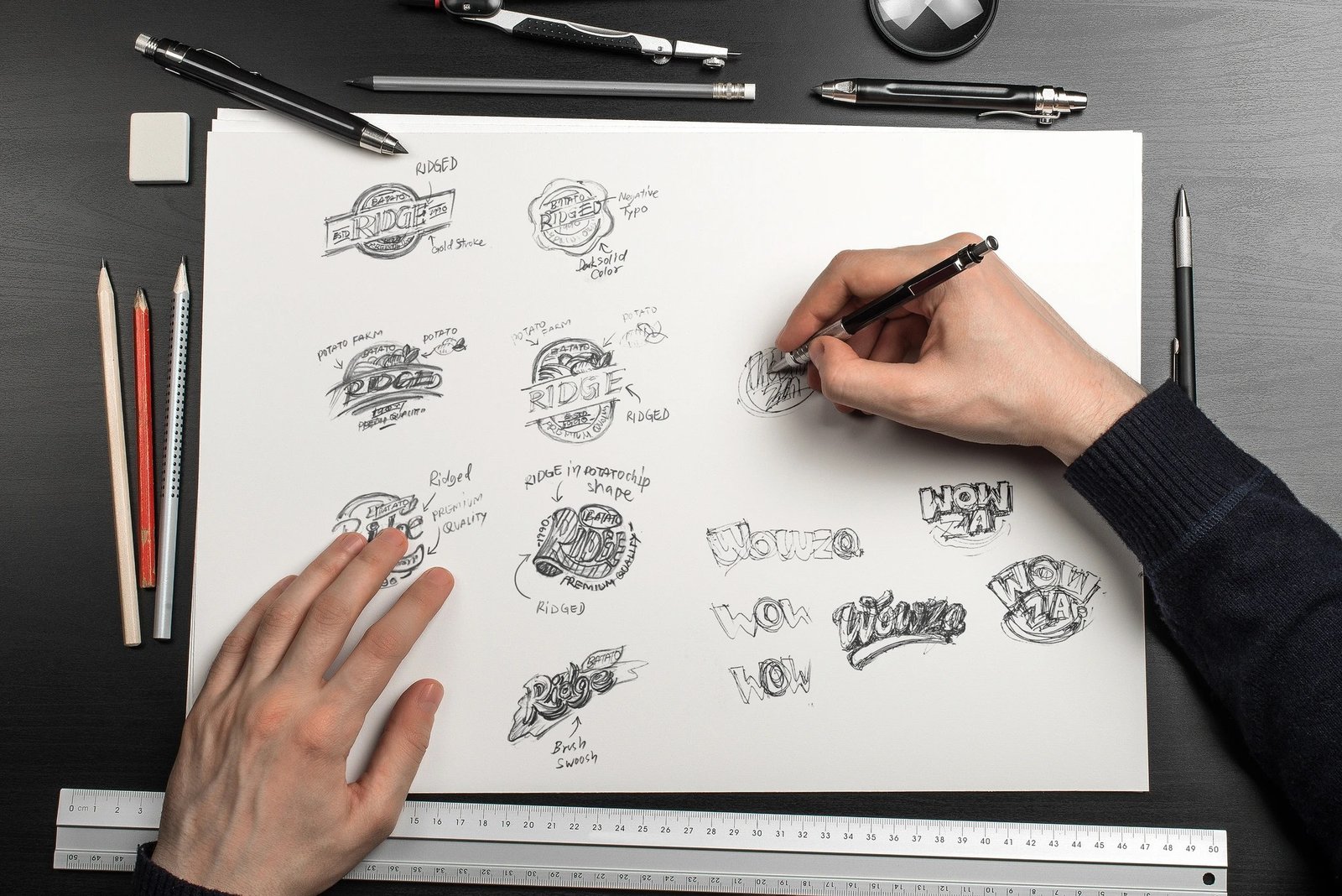
Before you open any design tool, grab a piece of paper and answer three questions: What do you sell? Who buys it? How do you want them to feel? A bakery logo should feel warm. A bookkeeping service should feel steady. When you know the feeling, the design choices get much easier.
Then look at five competitors. Not to copy them — to avoid looking exactly like them. If every coffee shop in town uses a brown coffee cup icon, that’s your cue to do something different. Write down what you like and what feels overdone. This ten-minute exercise will save you from the most common budget-logo trap: a generic mark that could belong to anyone.
Decide on your logo type too. Wordmarks (just stylized text, like a bakery name in nice lettering) are the easiest to DIY well. Icon-plus-text logos give you more flexibility for social media profile pictures. Emblems look classic but are harder to pull off without design skills. When money is tight, a strong wordmark beats a weak illustrated logo every time.
Free and Cheap Tools That Actually Work
You don’t need expensive software. Canva’s free logo maker is the starting point for most budget founders, and honestly, it’s good enough for a huge number of businesses. Pick a clean template, change the fonts and colors to yours, and resist the urge to add clip-art flourishes. Less is more.
A few other options worth knowing:
- Looka or Tailor Brands (free to design, pay to download): These AI logo generators ask about your industry and style, then generate dozens of options. Designing is free; you typically pay $20–$65 for the high-resolution files. Fine if you want a fast starting point.
- Hatchful by Shopify: Completely free, no catch. The styles lean simple, which is honestly a plus — simple logos age better.
- Inkscape or Figma: Free professional-grade tools if you want full control and are willing to watch a few tutorials. Figma in particular is friendly for beginners.
- Fiverr or 99designs contests: Not free, but you can get a decent custom logo for $25–$100 from freelancers. Read reviews carefully and check portfolios before hiring anyone.
Whatever tool you use, download vector files (SVG or EPS) if possible, not just a PNG. You’ll need vectors later for signs, packaging, and anything printed large. A PNG that looks fine on Instagram will turn into a blurry mess on a storefront banner.
Design Rules for Non-Designers
You don’t need a design degree, but you do need to respect a few basics. First: limit yourself to two fonts max — one for the business name, one for a tagline if you have one. Mixing three or four fonts is the fastest way to make a logo look amateur.
Second: stick to two or three colors. Pick them deliberately and write down the exact hex codes somewhere you’ll find them again. Your logo, website, and social profiles should all use the same colors. Consistency is what makes a cheap logo look expensive.
Third: make sure it works tiny and in black and white. Shrink it down to the size of a favicon. If it’s unreadable, simplify. Print it in pure black on white paper — if it still looks good, your design is solid. Most logos fail this test because people design at huge sizes on screen and never check the small version.
Finally, study what makes a logo memorable — the best ones are simple, distinctive, and appropriate for the business. Nike’s swoosh is just a check mark. Yours doesn’t need to be clever; it needs to be clear.
When It’s Worth Paying a Designer
DIY is fine to start, but there comes a point where a professional earns their fee. If your business is growing and the logo appears on packaging, vehicles, or signage, a designer will refine spacing, letterforms, and proportions in ways templates can’t. Think of your budget logo as version one — perfectly respectable — with a redesign planned for year two or three.
If you do hire someone, bring your DIY version as a starting point. It communicates your taste far better than a mood board of random logos. And always get the source files and full ownership in writing. A surprising number of founders pay for a logo and never actually own the files.
Budget Logo Mistakes That Scream “Amateur”
Free tools make logo creation accessible, but they also make the same mistakes accessible. Here are the ones I see constantly — and how to dodge each.
Mistake 1: The clip-art catastrophe. Templates tempt you to add icons, swooshes, and flourishes “to make it interesting.” Resist. Every extra element dilutes the design. The strongest budget logos are almost boring in their simplicity: clean type, one mark, done. If you can’t explain why an element is there, delete it.
Mistake 2: Trendy fonts with expiration dates. That ultra-thin minimalist font or the bold retro typeface looks current today and dated in eighteen months. For a logo you’ll live with for years, pick something with staying power — clean, readable, untrendy. Trendy is for Instagram posts, not identities.
Mistake 3: Designing only in color. Your logo will appear as a tiny social avatar, a fax-header grayscale, an embroidered patch. If it only works as a full-color masterpiece on your laptop, it’s not a working logo. The black-and-white test from earlier isn’t optional — it’s the whole exam.
Mistake 4: Inconsistent application. You made the logo — then used a different version on Facebook, stretched it on a flyer, and recolored it for a holiday post. Every inconsistency erodes the recognition you’re building. Save the official files in one folder, and make a simple rule: the logo never gets stretched, recolored, or “improved” on the fly.
Mistake 5: Skipping the trademark check. Before you fall in love with a name and mark, search the USPTO database (it’s free) and do a thorough web search. Discovering a conflict after printing 5,000 business cards is a special kind of pain. This costs nothing and protects everything.
Avoid these five and your budget logo will outperform plenty of expensive ones. The money you saved goes where it matters more at this stage — into the product, the marketing, and the runway that actually determines whether the business survives its first year.
The Bottom Line on Budget Logos
Creating a logo for your business on a budget comes down to this: keep it simple, keep it consistent, and don’t overthink it. Use a free tool, follow the basic rules, test it small and in black and white, and get back to the work that actually grows your business. A decent logo you ship this week beats a perfect logo you’re still “working on” six months from now — and it pairs naturally with how to build a brand people remember and marketing your small business on a tight budget. Once the logo’s done, put that same energy into writing product descriptions that sell, because clear words will move more product than any logo ever will.